21 Forecasting Production - Advanced
Highlights
- Learn how to use crop progress and condition reports to create growing season forecasts of yield.
Check Your Understanding
- Can you repeat the exercise for soybeans to forecast yield in a similar manner shown for corn?
In chapter 8 we learned about the growing season timeline, how important the summer months are for forecasting production and yield of corn and soybeans, and how to follow USDA estimates to stay informed. Now that we have used regression models in a few previous contexts we can revisit the topic of forecasting yield during the growing season using the crop progress and condition reports.
As we noted in chapter 8, there is a strong positive relationship between the condition ratings and realized yield. Since the crop progress and condition report is released once a week every Monday afternoon during the planting, growing, and harvest season, we can use a simple linear regression to translate this report into yield forecasts that we can update every week during the growing season.
Here is what the crop progress and condition report looks like.
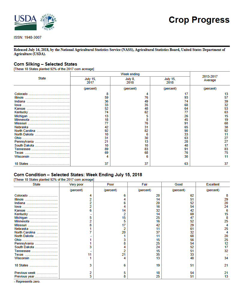
To create this report the USDA surveys farmers and other agribusiness professionals all over the major growing areas of the covered crops. Respondents are asked to rate the crop into one of five categories: Very Poor, Poor, Fair, Good, and Excellent.
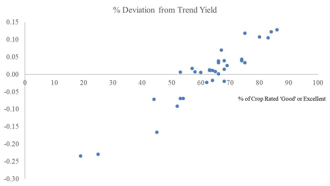
As one would hope, the percent of the crop rated good or excellent is positively correlated with yield outcomes.
Moreover, it may be informative to use the other categories from the condition reports to predict yields.
Work through the steps in the exercises to see how well we can predict yields with the crop progress report survey.
21.1 Exercises
The exercises for this chapter walk us through using the weekly crop progress and condition reports to create a forecast for yields that can be updated once per week during the growing season.
Highlights include:
- One way to deal with the fact that yields are trending over time in our forecast.
- Forecasting a variable that is not price (prices are the hardest things in the world to forecast!)
- We need to hold out one of the condition categories in our regression. (Why?)
First, download this excel file.
In the first sheet you will see the crop condition ratings at the end of each year from 1986 to 2018, and the realized yields for each of those years. In the second sheet, you will see for every week in every year the crop condition ratings. We will use these at the end to simulate what it would be like to use this forecast in real-time during the years of 1994 (a 19% above trend yield year) and 2012 (a 25% above trend yield year).
- Calculate the trend line of yields from 1986 to 2018.
- Calculate each year’s percent deviation from the trend.
- Plot the Yield per HA against ‘G+E’.
- What problems will arise if we try to use the Yield as the independent variable we want to forecast and use these condition categories to predict it? (Hint: There are two big ones.)
- Plot the ‘Percent Deviation from Trend Yield’ against ‘G+E’.
- Does the Percent Deviation from Trend Yield variable suffer from the same problem identified in (4)?
- Now, lets fit a regression model with the crop condition categories on the right hand side and percent deviations from trend yield on the left hand side.
Note: We need to leave out one of the condition categories. Why? (Let’s leave out the Very Poor category.)
- Use this regression model in the second sheet to generate a yield forecast for every week that a crop progress and condition report is generated.
Note: \(\hat{Yield}=(1+\%Deviation\_From\_Trend/100)*Trend\_Yield\)
Create a scatterplot with the yield forecast on the y-axis and the week number variable on the x-axis.
Now use the filter function to only show the year 1994. What happens to your forecasts as you move through the growing season?
Next, select only 2012 and discuss what happens to your forecasts as you move through the growing season?